In 1952 the 100th location opened. In the 60s they were starting to expand because of convenient popularity. In 1967 the company decided to make up some new building architect. Among the few was the well known "colonial" a-frame stores:

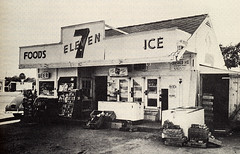
The original a-frames consisted of a black-shingled a-frame roof with white-lining on the roof, and a cupola. The front had the small square 7-Eleven logo beside two red squares, which are now orange, green, and red. Some locations also had a longer rectangle logo with the same design. Below was poles on the sidewalk and entry area, with orangish-brown brick. Most stores consisted of the actual store, an employee's office, the vault where frozen foods were kept, a warehouse, and an outdoor closet, and a few had bathrooms and an ATM room. In front was the familiar upright rectangle 7-Eleven sign, which was white with the logo that extended into green, on a black pole. Some variations also had a red "Open 24 Hours" sign, or a white-letter "Food Mart" sign.
Here is a late 60s 7-Eleven with the cupola, which is now a laundromat, and an early 70s 3-squared store sign:


Here is a vintage sign and an old sign mentioned above:


In the late 70s/early 80s 7-Elevens started to experiment with gasoline, which some competition had. The a-frames were also removed and replaced by a single triangle frame, or no frame at all, the stores started to get bigger, and existing stores started to get gas. Here is an example:

The gas signs also varied. Above was a small 2-square stacked sign with the logo and the Citgo (now either an "Oh Thank Heaven!" sign or a "Fast & Fresh" sign) and the 3 prices. Another was a tall 3-square stacked sign with the logo on top, the Citgo (now either an "Oh Thank Heaven!" sign or a "Fast & Fresh" sign) logo in the middle, and the gas prices on the bottom.

Here is a building with gas from the late 80s:

The stores without gas had a square sign on two poles with the logo. Sometimes they replaced the rectangular ones. Here is an example:

In the 1990s stores were getting even bigger, and a lot of small 70s stores began to move into bigger, Citgo gas stores. The buildings also had khaki colored bricks and bigger restrooms, and the inside was roomier. Here is a late 90s store:

I don't know much about the early 2000s since none opened over here at the time. I do have a picture of a unique 2002 one:

Today, 7-Elevens are getting more upscale. The buildings are beautiful and still consist of red brick. The signs are now small rectangular signs with the logo, small slogan, and gas prices. Here is one that opened in 2007:

In conclusion, even though 7-Eleven has went through many changes, the concept still remains, and America will always thank heaven.
No comments:
Post a Comment